![DecisionLensLogo-standard.svg]](https://supporthub.decisionlens.com/hubfs/DecisionLensLogo-standard.svg)
Sensitivity Analysis produces a ranking of alternatives based on Priority Value score. It gives an indication of the relative amount of stakeholder value or benefit derived from whatever ratings inputs and priority weights are chosen. Keep in mind that alternative Priority Value scores fall in a range of 0-1. An individual alternative's Priority Value score is not as relevant as its Priority Value score in relation to other alternatives.
This visualization is labeled "Sensitivity Analysis" because it enables you to test “what if” scenarios to see the scoring and ranking impact of changing priority weights and/or ratings inputs. The sensitivity displays from where alternatives draw most of their priorities in terms of the criteria. If you drag the bars to change the criteria weights you will see the resulting impact on the alternatives. If the alternative set is sensitive to changing priorities, then you will see shifts in the most preferred alternatives.
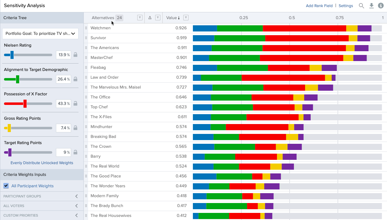
A common use of this screen is to drag out a single criterion to 100% of the decision and ask the question, “If this is all we cared about, then which alternative would deliver the greatest value to the organization?” When changing the criteria weights you will notice that, as you increase the weight of a criterion, the other criteria will decrease in priority proportional to their ratio relationships. The software retains those relationships among the criteria as they are manipulated. To return the criteria to their original weights, click the Revert button.
Drag the bars and quickly and easily see the effect of your what-if analysis on your weighted set of investments.
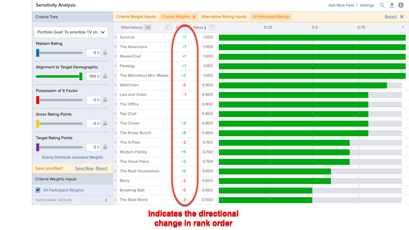
Sensitivity Analysis also provides an excellent mechanism for handling objections to the group’s criteria priorities. When briefing the results of a decision session, stakeholders often question the priority values derived by the group. We can mimic a situation where one criteria is increasing in value to see if it changes the most preferred alternative and what level of change is required to impact the alternatives.
Sensitivity Analysis allows us to not only change criteria weights and see our ranked project list by value score - it provides additional functionality related to project costs that we can further analyze.
Settings
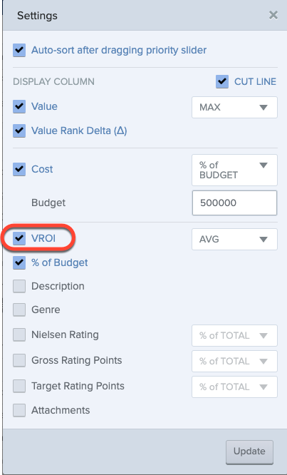
In the “Settings” area of the page, we can add columns such as cut line, cost data, and VROI, as examples.
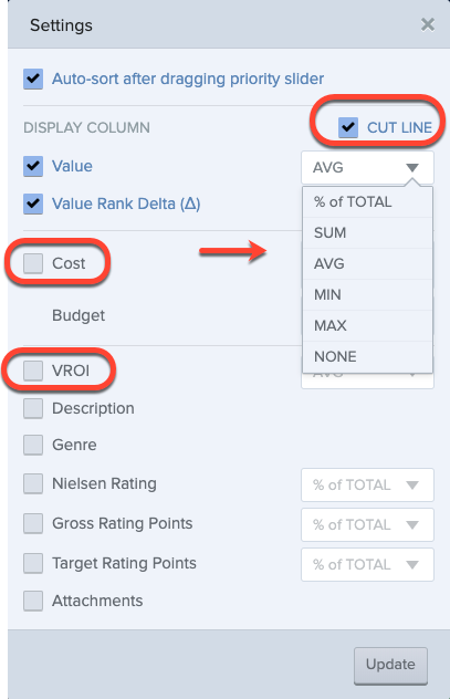
Cut Line
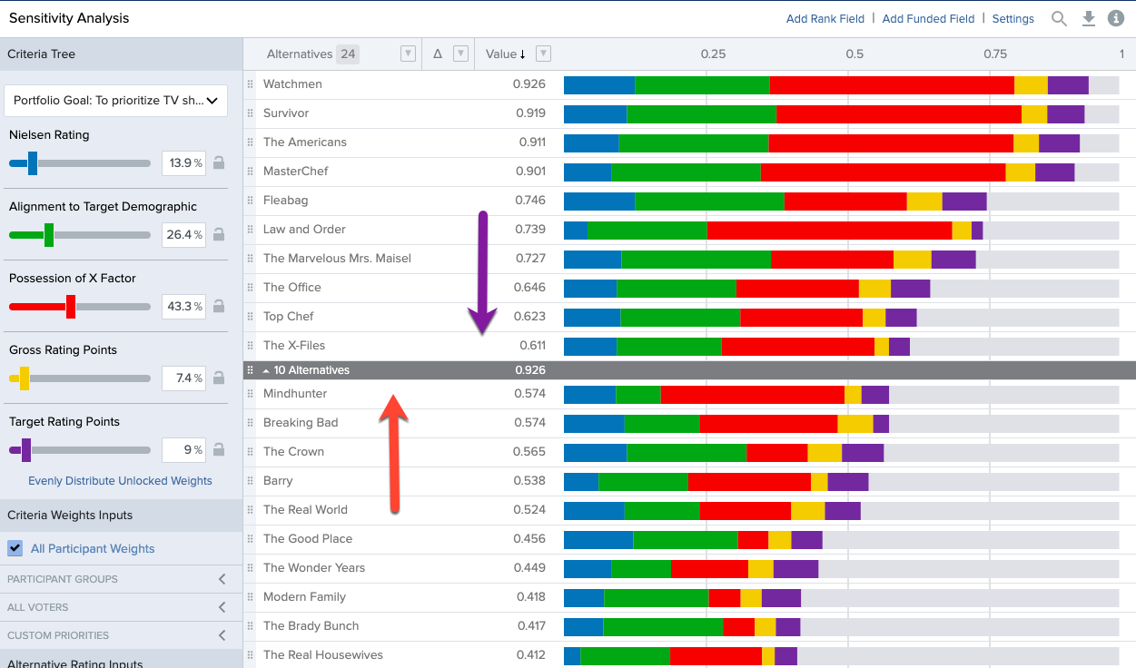
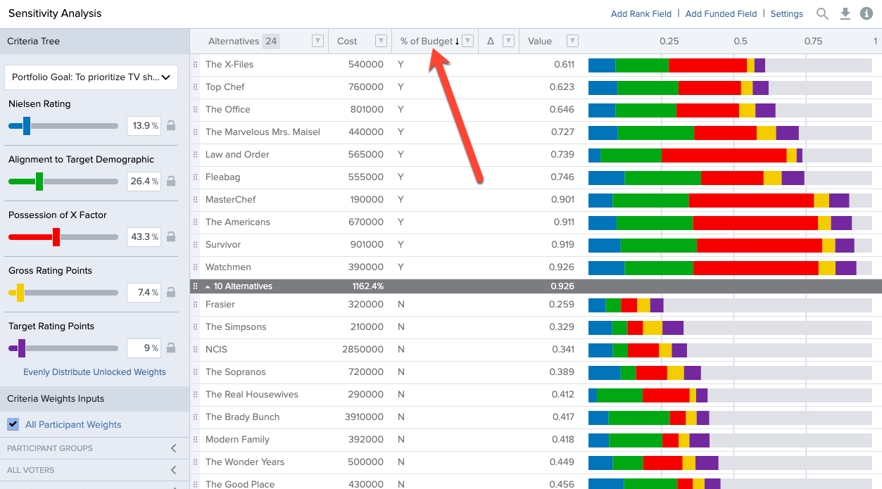
The cut line represents an above/below the line market in a portfolio. To add a cut line to the Sensitivity Analysis screen, check the box in the upper corner of the settings panel. Any numeric based fields can be selected to be part of the display. You are then offered an additional option to define the aggregation function for the cut line. The cutline will be displayed by default in dark grey and show your top 10 alternatives however you can manually drag the cut line to reposition it up or down your alternative list.
Cost Data
Sensitivity Analysis now allows for the display of Cost data, as well as VROI calculations using that cost data (discussed below). This Cost analysis is intended for simple above or below the line allocations in conjunction with the Cut Line. To input or edit Alternative Cost information, navigate to the Alternatives screen in your Portfolio. From the Alternatives page you can enable this single line-item Cost by selecting “Settings” and display Cost:
Once visible, Cost information for your Alternatives can be populated by copying and pasting or manually typed in. 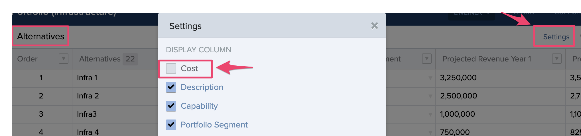
Back in Sensitivity Analysis, when Cut Line and Cost are both active, a field to provide a Budget amount will be enabled to represent the total available resources. Here you will once again define the aggregation function for the cost totals. This information will be displayed in the Cut Line.
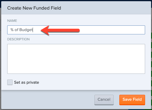
Saving a Cut line state based on your prioritizations and rankings is strongly suggested. By clicking “Add Funded Field” and naming the new field appropriately, will add a new state. This new field becomes a column that is then displayed. “Y” represent projects above the line and the “N” represents projects below the line.
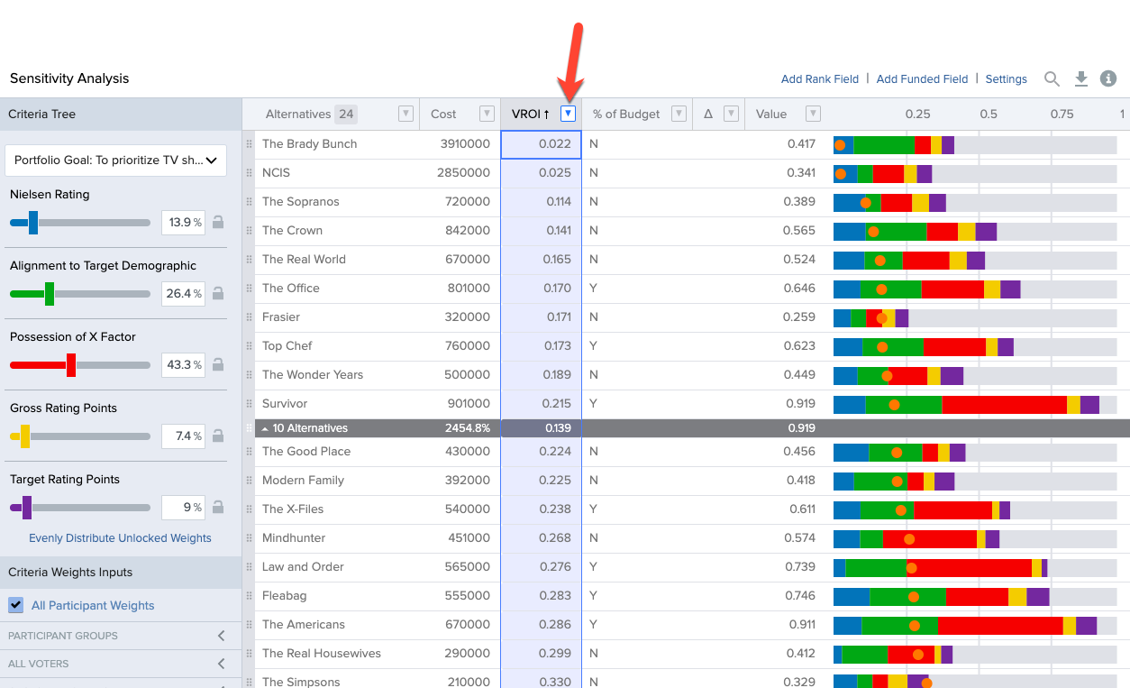
VROI
The presence of both value and cost in the Sensitivity Analysis screen allows Value-Return on Investment to be included. Value Return on Investment refers to your value to cost ratio in Decision Lens. How much bang for buck a project gives you. When enabled in “Settings” the VROI of each project will be calculated and displayed on the page. It is graphically represented on the Sensitivity Analysis colored bar chart as an orange dot.
Sort your page for easier viewing by VROI and use with cut line to mimic a scenario where you want to fund projects by their VROI score.
There is a lot of additional sorting and filtering functionality on this page that we hope you can utilize to best explore what-if scenarios and express your portfolios data story.