![DecisionLensLogo-standard.svg]](https://supporthub.decisionlens.com/hubfs/DecisionLensLogo-standard.svg)
The heatmap provides a graphical display of the Budget availability across Costs (Budgets) and Time.
The horizontal axis represents time with the leftmost column as the starting time period based on the defined analysis horizon and the rightmost column as the ending period of the analysis horizon.
The vertical axis represents the Cost Fields that are part of the portfolio. There will be as many rows of the heatmap as there are different Budgets defined.
Each section of the heatmap is defined by the intersection of a time period and Cost Field. For each of these sections, there will be an associated color that represents the degree of budget availability.
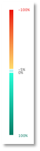
- Red tones indicate a negative budget availability for the time period for that given Cost Field (ie over budget with more allocation than Budget
- Green tones indicate a positive budget availability for the time period for the given Cost Field (ie under budget with less allocation than Budget
- Blue tones represent where there is a negative budget availability for the time period for that given Cost Field however the amount of overrun is less than defined tolerances (see Tolerance section for more information)
- Black represents where there is negative budget availability with allocations for locked or In-progress Projects greater than available budget. The algorithms would be unable to solve for these situations
Hovering over any section of the heatmap will provide additional details regarding the Budget, Allocation, and Budget Availability for that Cost Field and Time Period.
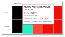
Double clicking on the section will navigate to the respective time period on the Schedule table filtering data to display on the specific Cost/Budget Field and Projects that are requesting from it.